UX.Design
Tencent
wifi master
About This App
Tencent WiFi Master (named in Chinese: Tencent WiFi Guanjia) is an App with more than 60 million users. And its daily active users are more than
5 million people.
By collecting a massive amount of WiFi Passwords from public providers (for example restaurants, cafes, shopping malls, train stations, etc) in the Cloud, this app provides WiFi passwords to the users. Here I am sharing my experience in 3 phases:
Phase1: fixing basic experience
Phase 2: Commercial & service expand
Phase1
fixing
basic
experiences
As I started being the UX designer for this App, my task was to fix the problem 'very difficult to understand how to use it'. This problem was very serious on the iOS system due to technical limitations.
'Dont know how to use it'

original design in 2015

translated into English
It took quite a while on my second day of work to understand what this App is about and how to use it. The steps a user needed to go through are:
Open the App, choose WiFi A and copy its password
Go to 'Settings - WiFi' but cannot find
WiFi A
Go back to App again, and realize that the WiFi list is different from the one from the Settings list
Try to match the two lists, or give up...
The main reason causing these complications is due to the iOS system limitation - it is only possible to click and connect a WiFi on 'Settings - WiFi' page, not on any App.
Design solutions


(wireframes)
First of all, our team has successfully convinced Apple to open access to the system
WiFi page, allowing us to match WiFi passwords with the WiFis and mark them with emojis.
On the interface, I have:
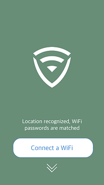
1. minimized the first page of our App into one button 'Connect a WiFi', as in the old design the list of WiFis is not correct and causes only confusion.
2. designed a simple animated tutorial to guide the users what to do next. This page also helped for a smooth pages switch.
3. prepared a push message 'please wait 3 seconds for matching WiFi passwords' when the users switched to the system page.
This design showed a very positive result in the usability test. However, I found out many other challenges...
'error?!
dont know what to do'


When our colleagues tested the App in our office area, the new design functioned very well. However, when we went to the city and asked people to test our App, we have found:
1. very often errors occur. For example, the WiFi password had been renewed, or the password was right but the WiFi did not work, etc.
2. when errors occurred, users did not read the pop-up windows that are supposed to guide them. 80% of the users closed the pop-up windows directly without reading it, because in error situations, pop-ups are interrupting their path of thinking.
As users did not understand why errors occur and what they could do, they thought the App was USELESS. So they uninstalled it.
Design solutions

(Animated prototype)
Instead of a standard pop-up, I have found a half-screen-size slide up message box was much easier to catch users' attention.
So when the user found out the WiFi password was wrong, he came back to our App, we cognized the WiFi is not connected and this message box would appear.
As technically we could not detect what was the problem, I first let the users select the problem they had, and then comfort them with solutions.
In 2015, this kind of pop-up window was very rare. Many of our bosses thought that this design is WEIRD. But with the successful usability test, I convinced them.


others
What's more, I have provided effective design solutions for the following topics, which will be written in my UX blog.
Phase2
commercial
and
service expand
After basic function is settled we headed to the second phase of our App - Profits! Meanwhile, we tried hard to explore more possible services (new functions) so our App could be even more competitive on the market.
Commercial
Our App provides free service. Profit comes from advertisements.
When a user needed to connect WiFi, he wouldn't pay attention to the ads.
After WiFi was connected, he wouldn't come back to our App.


First of all, we have to attract users to come back or stay (Android) in our App. We provided security check and Internet speed check functions.
Secondly, we implemented news from different media. So after connected to WiFi, users could read about current news. There we could implement ads.
After comparing and testing, I have found a 3-tap-structure the easiest way for the users to understand.


(The three tabs structure in wireframes)


(Final UI design on V2.0)
innovation
in new service
Besides implementing news content, our team tried very hard to create new services (functions) so we could provide more value to the users.
As I have studied Service Design in Oslo, Norway. I organized regular workshops to help our team to dig needs, finding out solutions and explore new possibilities.
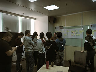


I invited designers, product managers, programmers and sometimes our bosses to our workshops. The outcomes were always positive:
1. by using the method 'Personas'.
'It is the first time,' they told me, 'I have ever thought about what if I were a mother with two kids in the supermarket, what would happen and what could our App do.'
2. by using the method Service Design cards.
It helped very much in the half year strategy brainstorming.
3. by bringing the whole team together in workshops. People all got the chance to contribute and to be creative.
In one and half year, there were more than 10 new services (functions) discovered and successfully implemented.
Phase3
Strategy
and
Branding
And we got other problems that were very difficult to solve:
1. Our competitors copy all the design, in all details.
2. Our main user groups are poor people (saving money by using public WiFi), so we are defined as a cheap App. And that brings lot of pains in commercial cooperations.
Branding
an app
'Is our App a CHEAP App for CHEAP people? And it shall always be like that?'
Starting from the end of 2016, I have presented 5 times in our company from our design team to our bosses, and then to the top managers about what branding means, and what change branding could make for the future of our App.
I took Airbnb as an example, explained how an App originally target for price-sensitive people could change the image and attract many people to be their customers.
And I got approved to lead a project to explore possible ways of branding our App.


With help from the User Research team we started a study of middle-class in our city, which is our target group. Our objectives were:
1. to understand what are the values that could affect them when they choose a product and what do they consider other than price.
2. to find out for middle-class people what occasions they would need/must have WiFi in public places.
3. to find out whether internet branding has the same effect on people comparing to traditional brands for products. (Brand character, brand loyalty, etc)
The outcome of this exploration project was:
1. directly used by our App design Version 3.0.
2. delivered to product managers for further strategic planning.